Common Search Terms:

The Marshall Brand
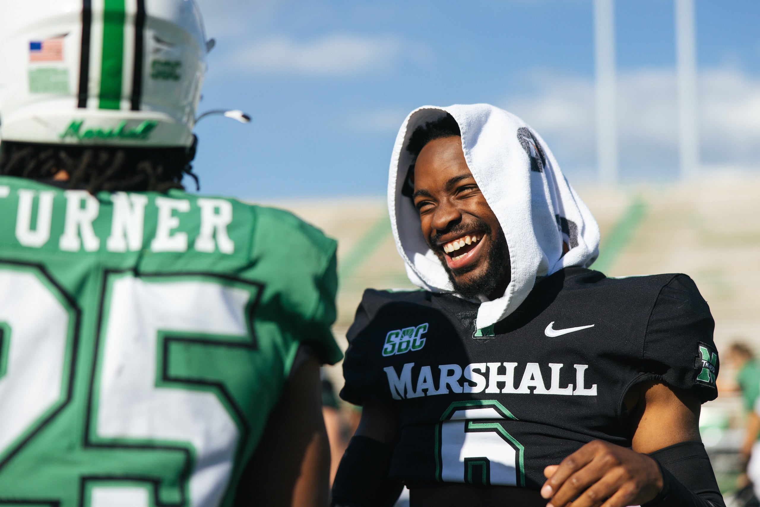
Be part of something big
We are all part of the Marshall community – student, alumnus, staff, or supporter – and that makes us all part of the Marshall brand. To help bring the Marshall brand to life and protect its integrity, this website is a connection point for partnerships in strategy development, asset creation, and resource management. It will help us tell the Marshall story and invite others in to make Marshall part of their own story.
The Fine Print
Before requesting a service, please take note of the following guidelines:
- All strategic marketing requests should support a strategic priority and help support the institution’s enrollment.
- All requests are subject to availability and varying turnaround times.
- A Marketing & Communications Department member will partner with you upon submission to help guide the request to a successful completion. Learn more about our process.
Start a Project & Develop a Plan
The following services are available to our Marshall Community


Not Sure Where to Start?
If you’re not sure where to start with your request you can submit a general request to our team and we’ll be happy to assist you.
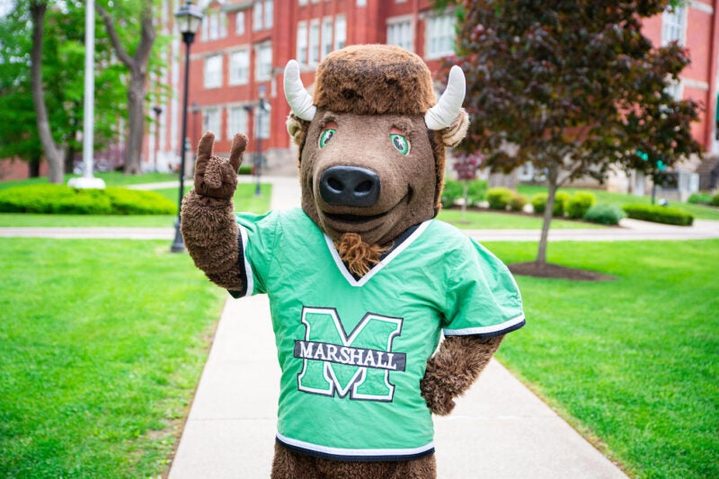
Request Marco
Request an appearance from our legendary mascot Marco at your university-approved event.
Marshall Magazine
The official magazine of Marshall University